

Aurecon U logo / 2019
Aurecon sought to elevate their well-established internal learning hub by branding it under a new name: Aurecon U. The goal was to create a distinctive logo mark that embodied the essence of the learning centre while aligning with the company’s vision for its future. The idea was to create a visual brand that marked Aurecon learning as industry standard learning.
This project followed many iterative designs, including four completely different initial concepts with significant refinement to reach the final design. This project required strong client collaboration and understanding to create a logo that represented the direction the client envisioned Aurecon U heading.
Creative concepts / Design and development / Storyboarding / Stakeholder engagement / Asset production

The standalone mark was for social media and web based use and on Aurecon's intranet site.
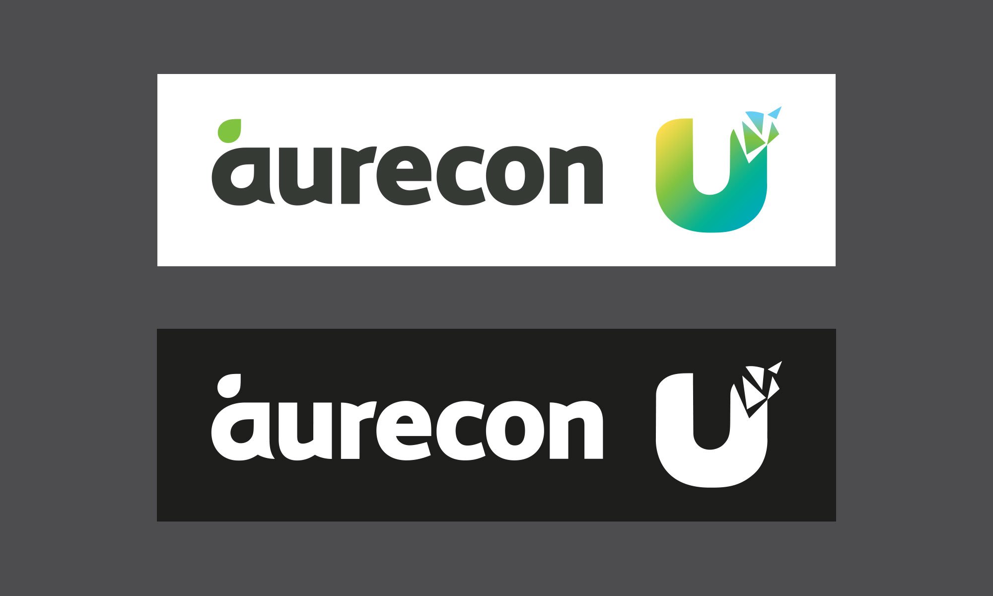
This is the full lockup of the Aurecon U mark with the Aurecon corporate logo.
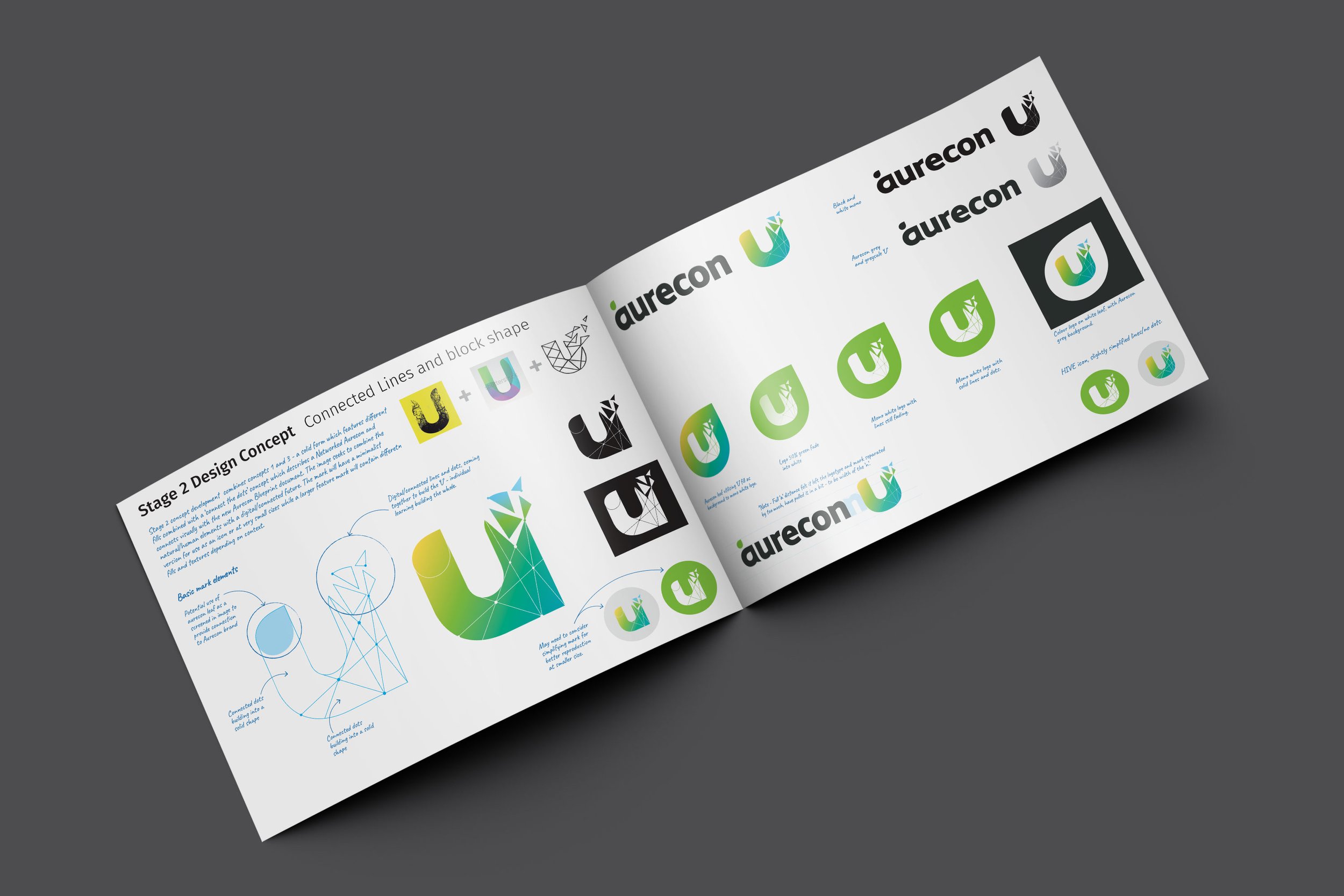
Development of this mark went through many iterations and phases, with presentations and along the way a strong narrative developed with the mark.